The colours you employ for your marketing campaigns set the standard for your brand. They can make your digital efforts stand out in a crowded marketplace and increase brand recall – essential if you want to really maximise your owned, earned and paid media reach.
Your company colours may already be decided but, that’s not to say that you can’t mix it up this year and use some of 2016’s hottest shades throughout your digital marketing activity. If you’re lacking a little inspiration, try our run down of the hottest hues and coolest colours which you can start using right away…
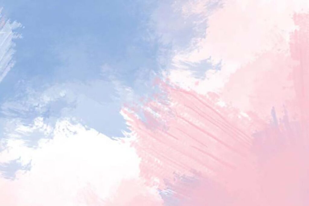
Rose Quartz and Serenity
The Pantone colour of the year is actually two colours this time around – Rose Quartz and Serenity. Explaining their choice, the colour gurus said:
“As consumers seek mindfulness and well-being as an antidote to modern day stresses, welcoming colours that psychologically fulfil our yearning for reassurance and security are becoming more prominent. Joined together, Rose Quartz and Serenity demonstrate an inherent balance between a warmer embracing rose tone and the cooler tranquil blue, reflecting connection and wellness as well as a soothing sense of order and peace.”
Pale rose and cool blue are an unexpected pairing but can be used to make a strong statement by businesses in fashion, health and wellness, fitness and even hospitality. You don’t need to use them in abundance, a subtle nod to the two shades will still be impactful if you’re consistent in its use. Try incorporating the blend in the next graphic you create for your social media posts this week.
Purples
Mid-tones are always in vogue, because they pair so well with other shades. Plums and purples look set to be popular this year, especially in more muted tones. Try deeper and lighter shades with different textured effects – especially in autumn and winter. They convey luxury, indulgence and abundance, perfect for giving winter communications a seasonal, Christmassy-feel.
Greens
Muted tones of green such as pale lime, opal, and thyme are fresh, serene and hint at wellness and nature. Use them in spring and summer marketing. Pair with metallics on leaflets and ebooks to create a really striking impression that will leave readers with a tangible impression of your brand.
If you want to ease your way into the energetic pairing of pale green and jazzy silvers, incorporate it into your next email marketing newsletter. It doesn’t need to be an image, using the two contrasting shades for a text headline will draw the eye, giving you a great shot at strong click through rates.
Image courtesy of American Flat and Pantone

